The Future of Digital Publishing?

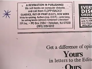
Last month’s news that NBC News is launching its first eBook publishing division, may have raised a smile of recognition from Paul Peacock, an ePublishing industry pioneer who announced his ebook publishing company in The New York Times Book Review in June 1991.

Paul, a Debategraph Associate in New York, views Debategraph as an exemplar of a new and powerful form of electronic publishing that he calls dynamic information graphs (or “difographs”); a concept that he explores in the guest post, and embedded graph, below.

Future A for digital publishing (where the word “publishing” is used, loosely, to describe the process whereby “books” are made available to the public) is to take “books” and put them into electronic containers. But they remain siloed collections of information.

With websites and blogs we are able to use hypertext “links” to jump between two-dimensional knowledge collections (between “pages” on the same site or between sites). We are not able to show anything about the relationship between these collections or explicitly show information associated with the links (although the Google algorithm could presumably tell us a lot).

This is a half-step away from Future A but still leaves us swimming in the information flow as we try to make sense of it.

A difograph or dynamic information graph is a hub-and-spoke system of information presentation laid out in space with information encoded into the “spokes” (links) that join hubs together. It can exist in two or three dimensions. Information of all kinds and types can be attached to a particular hub (in a “panel”). The difograph gives us a net to drag through the river of information so that we, standing now on the bank, can more easily understand what we are looking at. Furthermore, difographs produced by different publishing entities can be linked together, creating seamless larger networks.

Difograph publishing is the Future B of digital publishing. The “hub” is its fundamental element in the way the “book” is for the print publishing industry.

A “view” is a presentation frame centered on a particular element of a difograph. The embedded view above can be embedded on your website by clicking on the Embed link in the top navigation bar (when you are in the Display mode you prefer) to get the appropriate code. It will update automatically as changes are made to it. debategraph.org/difographe is a short web address for the graph.
Mapping the Political Contours of Cyberspace

William Gibson coined the term “cyberspace”, for his 1982 short story Burning Chrome to create a “a narrative engine, and a territory in which the narrative could take place”. Twenty years on, cyberspace is the world’s narrative engine: and an uncharted territory to which the world is still coming to terms.

Political, industrial, and civic leaders are gathering at the Foreign Office’s London Conference on Cyberspace next week to think through the implications, opportunities and contradictions of this emerging world.

The conference will explore key themes – prosperity; social good; freedom of access and expression; cyber crime and international security – with the aim of deepening mutual understanding and beginning to outline a political, social and economic strategy to secure the benefits of cyberspace while addressing the concomitant threats to personal and national security.

The Foreign Office would like the dialogue at the event and online to be as broad as possible – and, in support of this process, Debategraph will be mapping and curating the dialogue as it unfolds live and online.

To start exploring the map – which we have seeded with the initial framework of the conference – click on the small bubbles to move deeper into the debate and on the larger bubbles to move back up.

You can gain an insight into the range and scope of the debate by watching the map evolve here, but you are welcome to add your voice to the debate online by adding new ideas and comments to the map and by rating the ideas, or by suggesting new ideas and questions via Twitter using the #LondonCyber hashtag and/or the Foreign Secretary’s Facebook channel (both of which we will be monitoring as well).

As discussed before, the whole structure of the map is like a wiki – every aspect is provisional, and open to further refinement – and everyone can add new issues, positions, arguments and evidence to the map.

The aim is to weave together all of the arguments into a rich, transparent, non-linear structure that anyone can explore and understand quickly.

As with the other maps in the The Independent series you can keep up to date with developments via @TheIndyDebate on Twitter, and you are welcome to embed the map (like a YouTube video) on your own site or blog using the code shown below:

*Cross-posted at: The Independent

Controlling Persistent Infectious Diseases

The first in a quick series of posts to catch-up on some of our projects in 2011 so far.

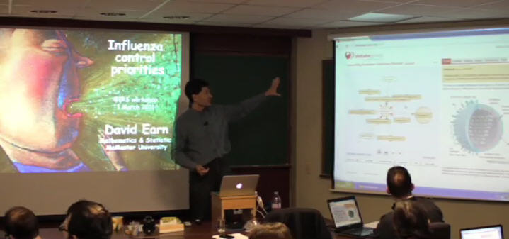
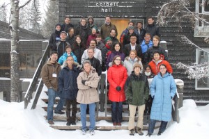
At the start of March 2011 I was privileged to map a 5-Day workshop on “Modelling and analysis of options for controlling persistent infectious diseases” at the Banff International Research Station for Mathematical Discovery and Innovation; part of the breathtakingly beautiful Banff Centre in Alberta, Canada.


The workshop gathered 40 leading mathematical modellers, infectious disease researchers, clinicians and public health officials from around the world to explore the past and future contribution of the mathematical modelling to public health policy, the priorities for future research, and potential ways to enhance the relationship between the research community and public health officials.

Debategraph was used throughout the five-day workshop to the map the live discussions and to facilitate the group dialogue around the key points arising – with group members contributing directly to the map as the workshop proceeded.

The map resulting from the discussions – which the group is continuing to develop beyond the workshop – is embedded below:

Defrag 2010

Thanks to a Kauffman Foundation Entrepreneur Scholarship and Market Visit support from UKTI, I had the great pleasure of attending Defrag 2010 in Colorado last month and the opportunity to savour the vibrant start-up ecosystem in Boulder.

Defrag is organized brilliantly by Eric and Kim Norlin, with a perfect blend of attention to the detail that matters and a confident and playful informalty that cultivates a sense of community and serendipity. The upshot is a stimulating gathering on a human-scale, in which you find yourself marvelling at scintillating speakers in one moment and engaged in an impromtu seminar with them in the next:


I took the opportunity to map parts of the conference live as well, with the map shown below. The result is more of a dynamic scrapbook than a comprehensive map (with the latter requiring several mappers to cover the parallel sessions and, ideally, collaborative curation from the conference commuity as well). However, the map gives a flavour of the way in which graphs of this kind can be used to connect and distill the conference community, ideas and conversation from one conference to the next.

The graph also includes the slides from the presentations that have been made available online to date.

I travelled to Defrag with high expecations: and those expecations were exceeded by far; so, if you have the chance to attend Defrag 2011, seize the moment…

…and, if you can’t wait to sample the fun: Blur and Glue beckon too.

Debategraph honored as one of the AASL’s Best Websites for Teaching and Learning

Peter and I were delighted to discover last week that Debategraph has been named as one of the American Association of School Librarians (AASL) Best Websites for Teaching and Learning 2010.

AASL Best Websites for Teaching & Learning

The award honors the top twenty-five Internet sites for enhancing learning and curriculum development and for fostering the qualities of innovation, creativity, active participation and collaboration, with the chosen sites identified as the “best of the best” by the AASL.

It’s a particular joy for us to see Debategraph recognized in the company of sites that we love using ourselves, such as TED, Creative Commons, Prezi and Evernote, and to discover marvellous new sites among the awardees that are fast becoming favorites too.

The full list of awardees is available here, along with the individual citations accompanying the award for each site.

…and, finally, a big thank you to the AASL’s Best List task force, to everyone who nominated us and, most importantly, to the Debategraph community for all your support and inspiration.

Cross-posted at: Open to Persuasion

Dissecting the Conservative – Liberal Democrat Coalition Agreement

As part of The Independent’s visual mapping of the election and its aftermath, we have broken down the Conservative – Liberal Democrat Coalition Agreement into an interactive visual graph that lets you comment on and rate each of the proposals.

By surfacing their shared agenda for the next Parliament explicitly in this way, the Conservatives and the Liberal Democrats  have given the electorate an unusually swift and detailed opportunity to give feedback on the proposals they have drawn together in our name.

Both parties have also indicated the desire to open public policy deliberation to wider public input online during the coming parliament; so it’s a timely opportunity as well to consider to what degree—under the intense pressure they faced and in a closed rather than an open process—the party negotiating teams were able to find an agreement close to a mutual optimum.

As well as rating and commenting, you can use the interactive graph to add arguments for and against the Coalition proposals and to suggest alternative ideas that might have been missed.

So, in the new spirit of collaboration, what do you make of the agreement?

Collaborative Democracy in the White House

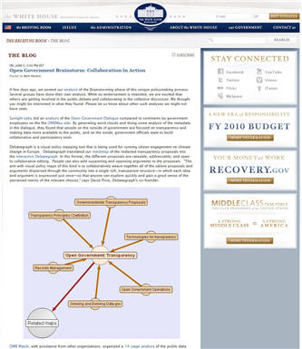
If you have been following the White House’s groundbreaking Open Government Initiative over the past few weeks, you’ll be aware already that Debategraph has been mapping the proposals emerging from the Open Government Brainstorming sessions on Participation, Transparency and Collaboration.

WhiteHouseDebategraph

The Open Government Initiative moved into the third, and most significant, Drafting phase today—and we’re delighted to note that the White House’s Open Government team has entrusted this vital phase to our favourite wiki team at MixedInk (who, if you haven’t discovered them yet, offer a truly innovative and powerful approach to the task of collaborative writing, which is ready to be applied in multiple contexts).

The initial Open Government Brainstorming and Discussion phases have been stimulating and generative, but the real collaborative work, the real collaborative responsibility, and the real collaborative opportunity lie in the next phase of synthesis.

So get writing!

…and, to help you on your way, here’s the combined Debategraph of the redacted proposals from the three brainstorming sessions:

Reblog this post [with Zemanta]

Integrating Debategraph with SharePoint

When you are developing a web application one of the most delightful compliments anyone can pay you is to start building on your work. And when the person building is an expert in multiple fields including your own, your joy is complete.

So a huge thank you today to Paul Culmsee and his colleagues at Seven Sigma Business Solutions for building and releasing the free Seven Sigma Debategraph WebPart for SharePoint – which lets you embed live debate maps into SharePoint sites and tune the display to fit enterprise SharePoint portals.

 mscomsp_logo

Paul, who has written a brilliant series of posts on the value of issue mapping to SharePoint projects, explains the underlying motivation for the web part:

“SharePoint is a terrific product for aggregating disparate information into a single integrated view. However it is oriented around linear, “list based” information, such as calendars, tasks, documents and the like. Argument visualisation tools like Debategraph do an excellent job of exposing the deep structure of complex problems or issues in a manner that makes argumentation and decision rationale accessible.

The Seven Sigma Debategraph web part for SharePoint provides a means to surface Debategraph argumentation maps within SharePoint. Through the release of this web part, Seven Sigma hopes to increase use of argumentation mapping techniques as a means to facilitate cohesive and productive discussions on complex issues.”

To illustrate the potential, and working with fellow SharePoint gurus Andrew Jolly and Ruven Gotz, Paul has created the Debategraph below on SharePoint Governance – which is also the default starting map when you install the web part:

If you are SharePoint user and would like to experiment with the web part, you can download it here – where Paul also provides short video guides on installing and using the web part.

…and if you would like to learn more about the background to the web part and our collaboration with Seven Sigma, read Paul’s characteristically insightful and engaging blog post here.


Reblog this post [with Zemanta]

Mapping the Power of Information Taskforce Report

poiwordletwo

As a follow up to the Public Services 2.0 workshop in Brussels last month, and in keeping with the collaborative ethos and intention of the event, Richard Stirling, one of the Cabinet Office secretaries to the Power of Information Taskforce, asked me to receate the Taskforce’s landmark report in Debategraph.

The initial map (shown in the Debategraph Explorer view above) foregrounds the report’s recommendations—although the full text of the report is also included in the expanded text of the relevant elements on the map (which you can view by clicking on the Green + button above).

Once in this format, anyone can comment on, support or oppose, and rate the individual recommendations—and also begin to increase the granularity of the analysis by, for example, breaking out the arguments presented in the report in support of the recommendations by the Taskforce.

This Explorer view of the report (above) can also be shared and embedded on blogs and other websites using the following code:

<iframe src=’http://debategraph.org/flash/fv.aspx?r=14255&d=2&i=1′ frameborder=’0′ width=’450′ height=’600′></iframe>

As ever feedback about the work-in-progress, either directly on the map, or in the comments below, will be very welcome—and, in the meantime, for a quick insight into the way that the ideas articulated in the Power of Information Taskforce’s report are percolating in the US, check out Ellen Miller’s Sunlight Foundation blog.

Reblog this post [with Zemanta]