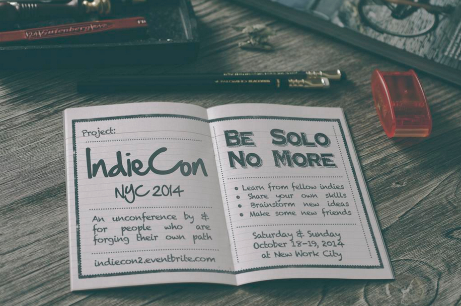
IndieCon NYC 2014

DebateGraph is proud to be sponsoring IndieCon NYC 2014 at the fabulous New Work City this weekend.

IndieConNYC_Invitation

A highly creative and stimulating unconference awaits, in one of New York’s most interesting and innovative co-working spaces – and, if you are lucky enough to be there, don’t the miss the delightful chance to say hello to long-term DebateGraph champion and mapping expert Paul Peacock.

Have fun!

Controlling Persistent Infectious Diseases

The first in a quick series of posts to catch-up on some of our projects in 2011 so far.

At the start of March 2011 I was privileged to map a 5-Day workshop on “Modelling and analysis of options for controlling persistent infectious diseases” at the Banff International Research Station for Mathematical Discovery and Innovation; part of the breathtakingly beautiful Banff Centre in Alberta, Canada.


The workshop gathered 40 leading mathematical modellers, infectious disease researchers, clinicians and public health officials from around the world to explore the past and future contribution of the mathematical modelling to public health policy, the priorities for future research, and potential ways to enhance the relationship between the research community and public health officials.

Debategraph was used throughout the five-day workshop to the map the live discussions and to facilitate the group dialogue around the key points arising – with group members contributing directly to the map as the workshop proceeded.

The map resulting from the discussions – which the group is continuing to develop beyond the workshop – is embedded below:

Debategraph honored as one of the AASL’s Best Websites for Teaching and Learning

Peter and I were delighted to discover last week that Debategraph has been named as one of the American Association of School Librarians (AASL) Best Websites for Teaching and Learning 2010.

AASL Best Websites for Teaching & Learning

The award honors the top twenty-five Internet sites for enhancing learning and curriculum development and for fostering the qualities of innovation, creativity, active participation and collaboration, with the chosen sites identified as the “best of the best” by the AASL.

It’s a particular joy for us to see Debategraph recognized in the company of sites that we love using ourselves, such as TED, Creative Commons, Prezi and Evernote, and to discover marvellous new sites among the awardees that are fast becoming favorites too.

The full list of awardees is available here, along with the individual citations accompanying the award for each site.

…and, finally, a big thank you to the AASL’s Best List task force, to everyone who nominated us and, most importantly, to the Debategraph community for all your support and inspiration.

Cross-posted at: Open to Persuasion

Dissecting the Conservative – Liberal Democrat Coalition Agreement

As part of The Independent’s visual mapping of the election and its aftermath, we have broken down the Conservative – Liberal Democrat Coalition Agreement into an interactive visual graph that lets you comment on and rate each of the proposals.

By surfacing their shared agenda for the next Parliament explicitly in this way, the Conservatives and the Liberal Democrats  have given the electorate an unusually swift and detailed opportunity to give feedback on the proposals they have drawn together in our name.

Both parties have also indicated the desire to open public policy deliberation to wider public input online during the coming parliament; so it’s a timely opportunity as well to consider to what degree—under the intense pressure they faced and in a closed rather than an open process—the party negotiating teams were able to find an agreement close to a mutual optimum.

As well as rating and commenting, you can use the interactive graph to add arguments for and against the Coalition proposals and to suggest alternative ideas that might have been missed.

So, in the new spirit of collaboration, what do you make of the agreement?

Collaborative Democracy in the White House

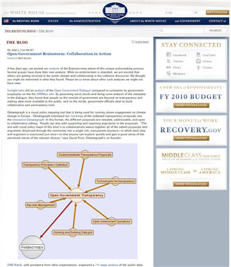
If you have been following the White House’s groundbreaking Open Government Initiative over the past few weeks, you’ll be aware already that Debategraph has been mapping the proposals emerging from the Open Government Brainstorming sessions on Participation, Transparency and Collaboration.

WhiteHouseDebategraph

The Open Government Initiative moved into the third, and most significant, Drafting phase today—and we’re delighted to note that the White House’s Open Government team has entrusted this vital phase to our favourite wiki team at MixedInk (who, if you haven’t discovered them yet, offer a truly innovative and powerful approach to the task of collaborative writing, which is ready to be applied in multiple contexts).

The initial Open Government Brainstorming and Discussion phases have been stimulating and generative, but the real collaborative work, the real collaborative responsibility, and the real collaborative opportunity lie in the next phase of synthesis.

So get writing!

…and, to help you on your way, here’s the combined Debategraph of the redacted proposals from the three brainstorming sessions:

Reblog this post [with Zemanta]

Mapping the Power of Information Taskforce Report

poiwordletwo

As a follow up to the Public Services 2.0 workshop in Brussels last month, and in keeping with the collaborative ethos and intention of the event, Richard Stirling, one of the Cabinet Office secretaries to the Power of Information Taskforce, asked me to receate the Taskforce’s landmark report in Debategraph.

The initial map (shown in the Debategraph Explorer view above) foregrounds the report’s recommendations—although the full text of the report is also included in the expanded text of the relevant elements on the map (which you can view by clicking on the Green + button above).

Once in this format, anyone can comment on, support or oppose, and rate the individual recommendations—and also begin to increase the granularity of the analysis by, for example, breaking out the arguments presented in the report in support of the recommendations by the Taskforce.

This Explorer view of the report (above) can also be shared and embedded on blogs and other websites using the following code:

<iframe src=’http://debategraph.org/flash/fv.aspx?r=14255&d=2&i=1′ frameborder=’0′ width=’450′ height=’600′></iframe>

As ever feedback about the work-in-progress, either directly on the map, or in the comments below, will be very welcome—and, in the meantime, for a quick insight into the way that the ideas articulated in the Power of Information Taskforce’s report are percolating in the US, check out Ellen Miller’s Sunlight Foundation blog.

Reblog this post [with Zemanta]

Debategraph in the Classroom

When Peter and I first set out to create Debategraph, one of our fondest hopes was that the tool might help to enrich the collaborative and visual learning experience for students in schools and universities.

So it has been a joy for us this semester to be experimenting with Debategraph in classroom with Dr Sharon Chanley and her politics students at Western Illinois University—and we are tremendously grateful to Sharon and the students for having the curiosity and courage to innovate in this way.

circlesmall

 Dr Sharon Chanley and the students of POLS 275

Sharon’s class is exploring issues of poverty and wealth inequality in the U.S. and the historical and existing public policy responses to these, and Sharon explained to us what initially captured her imagination about Debategraph:

When I first came upon the DebateGraph in my search for policy-mapping examples, I felt as if someone had designed it specifically for my approach to teaching — almost as if they had observed my discussion-based classes and then depicted them graphically. In teaching policy issues and the political processes involved, I want students to understand their complexity and the interrelatedness of the issues. DebateGraph allows me to do that in a way that two-dimensional images and discussion alone can’t. Students develop their ability to research their positions, find answers to the compelling questions, and enhance their critical thinking skills while providing me a way to comment on and complete individual assessment of their work — all important to their learning in and beyond the classroom. And, they can do it in a format that fits into their familiarity with the computer, the Internet, and their preference for the visual and importantly in a way that connects them with the rest of the world.”

During the first phase of the course Sharon and the WIU students—Brandon, Colisha, Derek, James, Jan, Jared, John, Julio, Kimberly, Patrick, Robert, and Ruth—are using Debategraph to build an informal collaborative overview of the policy domain. You can see their work in progress below—and in the next phase of the course the emphasis will shift more to deepening the map and developing a more formal structure for the material.

We have been delighted with the enthusiastic feedback from the students so far, who have taken to this new approach to learning in fine style:

I like the DebateGraph as a learning tool because it teaches us how to do in-depth research. It also allows us to open up class discussions, which allows us to hear other people’s points of view.

The DebateGraph is an excellent learning tool which helps students learn through critical thinking. I really enjoy the exercise.

computersmall

I think the DebateGraph is an outstanding learning tool. It forces the student to look in-depth at a particular subject. It makes people come up with questions to see if the particular problem can be resolved.

In general, I like the graphics display as a study tool. The generation tends to like information that is bite-sized, easily accessible, and fast paced, so the point and click nature makes it very easy to find information and explore related topics which may have been otherwise overlooked.

DebateGraph is not only a great tool, but it has allowed me to gain new knowledge. It is also a great tool for students to learn about policy issues, and it is also a great tool to use.

The DebateGraph is a really cool way to debate topics so that there is a structure and much more information can be transferred.

The students’ feedback is all more gratifying given that 40% of their overall course grade is being assessed on their individual and collaborative contributions to the map. And Sharon has been employing the RSS feed, email alerts, and edit history to support her grading process—and the map Message Board to ask, and answer, student questions outside class hours.

From our perspective it has been a wonderful start, and an experience from which Peter and I are learning much too about the ways in which Debategraph can be used in the classroom; a learning experience for which we would like to give Sharon and her pioneering students a wholehearted Anglo-Australian vote of thanks.

Visualizing Middle East Peace

The events in Israel and Gaza this year have prompted gloomy prognoses for the prospects for peace; a mood deepened by the mixed signals from the Israeli election and the latest developments with Iran.

Lord Patten, writing for European Voice last month, struck a particularly bleak note:

"However tough things looked in the past, I have never felt such a sense of despair about Palestine and Israel. Reason has been drowned in blood. It seems as though the politics of hope have given way to the politics of the cemetery. Poor Palestine. Poor Israel."

Independent readers and the Debategraph community have started to explore the options for peace in the Middle East over the last few weeks, and, though the map is still at an early stage of development, it already provides a succinct insight into the nature and scale of the challenge; showing how strong views at either end of the spectrum pull the peace proposals towards the gyre of despair.

One of the advantages of visual mapping in this context, though, at least at the outset, is that it’s not asking anyone to take sides: just asking everyone to pool their understanding to map the contours of the problem.

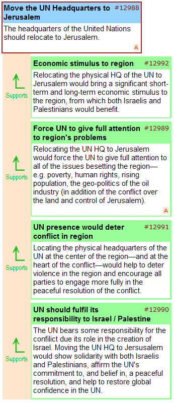
The visual mapping process also opens up the possibility of creative brainstorming and lateral suggestions, such as the proposal to relocate the UN headquarters to Jerusalem, illustrated below – and we would like to see more contributions of this kind as the map develops over the coming weeks.

unhq

(click here to view live)

Given the progress made with the map so far, and the work still ahead, we’re extending the first mapping phase through the spring, and, will be including other partners in the process as we seek to engage the main actors in the region.

Anyone who would like to join us in this process is welcome to do so, and, if you would like to involve your own blog or website readers in the debate, you can embed the map—like a YouTube video—using the embed code shown below:
 

<iframe src=’http://debategraph.org/flash/fv_indep.aspx?r=11474&d=2&i=1′ frameborder=’0′ width=’490′ height=’650′ scrolling=’no’></iframe>

In the meantime, I will be examining different areas of the map in detail on the blog over the coming weeks and will present the mapping community’s work-in-progress to a conflict resolution forum in Haifa later this year.

Cross Posted at: Independent Minds

Government 2.0 – only connect…

“Only connect… Live in fragments no longer.” E. M. Forster, Howards End (1910).

Government 2.0?

The lightweight, collaborative, multiway technologies emerging across the web, and the new patterns of social interaction associated with them, are about to transform the shape of government, our experience of government, and our participation in government. To misquote Clay Shirky: government that’s targeted at you but doesn’t include you may not be worth sitting still for.

But what kinds of government will emerge from this process?

Paul Johnston and the Connected Republic team have been thinking deeply about this, and today published Seven Principles of Government 2.0 that articulate their sense of the ways in which things may be different.

Their suggested principles are:

  1. A less Hierarchical Public Sector: Government 2.0 will have moved away from command and control, devolving much more decision-making to local units and frontline staff.
  2. A Collaborative, Joined-up Public Sector: Government 2.0 will offer a more joined-up face to citizens and will use collaborative models and tools to break down silo barriers, maximise the use of precious resources and dramatically reduce process time cycles.
  3. A Public Purpose Sector: The boundaries of Government 2.0 will be wider and more flexible, enabling creation of public value by a ‘public purpose’ sector which will be much broader and more diverse than the traditional public sector.
  4. Empowered Citizens: Government 2.0 will enable citizens to do more for themselves, either individually or collectively, as co-producers of services and shapers of public policies.
  5. A Feedback-driven Public Sector: Government 2.0 will be radically closer to citizens and will give multiple and real opportunities for feedback, and will ensure the feedback has a real impact in shaping its decisions.
  6. Open and Transparent Government: Government 2.0 will be radically more open and transparent than current models in relation to policy making, service delivery, internal administration and accountability processes.
  7. Facilitative Government: Government 2.0 will see government’s role shift much more towards creating context, orchestrating and facilitating, rather than controlling and delivering, public discourse and service delivery.

In keeping with the spirit of the analysis, the principles are open for discussion on a new wiki on the Connected Republic site.

On your way over to wiki, you might also like to glance at: Personal Democracy Forum 2008: Rebooting the System, From Wikinomics to Government 2.0 (via Don Tapscott), How Web 2.0 can Reinvent Government, and Liza Sabater’s The Cluetrain Manifesto for People Powered Politics.