Obama: Making Sense of the World?

And so the kaleidoscope turns, and we see the world anew.

Or do we?

Barack Obama’s inauguration today as the 44th President of the United States of America, marks the end of a remarkable personal and national journey. Arrival at such a destination is a cause for global celebration. But as with all great journeys the arrival is also only a beginning.
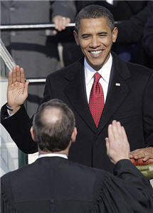
inaugration

Obama is taking a leading role in a world system that is severely perturbed on multiple levels. Such perturbation often proceeds collapse: and can proceed the emergence of a more sophisticated and better-adapted system.

It’s not clear—it never is—to what extent the choice of branching paths is open to us. But it surely behoves us to act as if it is.

My (personal) sense is that we face a mess of complex, interrelated and non-linear problems; sane responses to which lie beyond our existing methods and tools. In essence, we need to re-configure our modes of political thinking and organization to enable us—as local, national, and international communities—to move significantly closer to collective maxima of intelligence (both reasoned and emotional).

For those for whom the analogy is familiar, we’re awaiting The Mother of All Demos in the political realm to match Doug Engelbart’s technological masterpiece 40 years ago (which pre-figured much of the technological landscape that we inhabit and take for granted today). It’s the social dimension of Engelbart’s vision of augmented collective intelligence that lags behind our technological achievements: and it needs to catch up quickly.

The signs are that Obama, and the team around him, are mindful of this. As others have noted already, one of the most encouraging aspect of the Change.gov experiment was the speed at which the interaction on the site improved iteratively across the transition. The challenge now is how to crystallize this process—to enable genuine and deeply collaborative sensemaking—and how to set this process in motion in the first few months of the administration when the opportunity and receptivity to change are greatest—and when the character of the administration will be forged.

Readers of The Independent and others who have joined in developing the Obama and Gaza maps over the last couple of months have demonstrated on a smaller scale and in vitro that different and radically collaborative models of sensemaking are possible—and we are grateful to everyone who has participated directly so far, blogged about and embedded the maps, and to the BBC World Service’s Digital Planet, BBC Technology and PRI’s The World: Technology podcast for their support in spreading the maps more widely.

Both maps will continue to develop as exploratory exemplars of the kinds of cumulative, comprehensive and distillative sensemaking processes that the web is starting to enable—with the Obama map, in particular, shifting to a focus on the first 100 days.

Deeper challenges remain. The emerging set of collaborative sensemaking and deliberation tools of which Debategraph, is one example, are still nascent, still figuring out the basic principles—still more VisiCalc than Excel. The tools require a basic visual literacy that itself is only just beginning to emerge in society. And the maps, and other sensemaking constructs, require time to build and time for reflection in an impatient and attention-poor age.

But, today, of all days, is a day for optimism. The day on which Barack Obama embodies the realization that long journeys towards distant mountain tops can reach the summit.

Cross-Posted at: Independent Minds

mySociety's Free our Bills! campaign

The ever inspiring mySociety launched its first campaign on Tuesday, with a characteristically simple, pragmatic and catalytic focus: to open up the legislative process to wider and more effective scrutiny by publishing Bills in a semantically marked-up form that can be automatically interpreted and used across the web in imaginative ways.

mySociety's Free our Bills! campaign

It’s a small, manageable change, with a potentially big pay back to public life. And it won immediate endorsement from David Cameron and Lynne Featherstone.

One of the most promising, but relatively underdeveloped, strands of the debate we mapped for Downing Street last summer about the systemic failings of the relationship between politics, the media, and the public, was exactly this potential for apparently small-scale changes that enable the power of the web to work at key points of leverage to transform the overall character of the system.

Long may mySociety continue to demonstrate this.

Ethics Bites: Sport and Genetic Enhancement

David Edmonds, award winning BBC World Service Radio producer, co-author of Wittgenstein’s Poker and Bobby Fischer Goes to War, and one of the smartest, most modest, and most decent people you could have the privilege to meet—full disclosure: we’re friends—has a new venture under way.

In cahoots with fellow philosopher and broadcaster Nigel Warburton, David is producing an excellent series of short philosophy podcasts with leading contemporary philosophers; which, with characteristic élan, has just exceeded 1 million downloads.

The original Philosophy Bites series features interviews with among others: Myles Burnyeat, Anthony Kenny, Melissa Lane, AC Grayling, and Kwame Anthony Appiah. It has also spawned a second, equally thought-provoking series, Ethics Bites, for the Open University; with interviewees including: Mary Warnock, Michael Sandel, and Peter Singer. The OU series is also a must for Trolley-ologists.

To celebrate David’s and Nigel’s millionth download, we thought that it might be fun to map one of the podcasts. So here’s my first rough take on Michael Sandel on Sport and Genetic Enhancement. Feel free to enhance any shortcomings on my part…

If you are interested in pursuing the arguments in more detail, Michael Sandel’s views on sport and genetic enhancement are set out in full in his book The Case Against Perfection and summarised in the Atlantic Monthly.

Can computers think? Mapping the great debates

We stand on the shoulders of giants

“…so that we can see more than they, and things at a greater distance, not by virtue of any sharpness of sight on our part, or any physical distinction, but because we are carried high and raised up by their giant size.”

Robert Horn is one of my giants.

Twenty years ago, Bob looked at humanity’s troubled progress through the increasingly complex maze of philosophical, scientific, technological and political debate and realised that we needed maps.

But what kind of maps? What would they look like? What form would they take?

The way to figure this out, Bob reasoned, was to experiment with an extraordinarily complex debate. And he picked a spectacular one: the debate raging across philosophy, cognitive science, mathematics, neurobiology and computer science around the deceptively simple question “can computers think?”. A debate Alan Turing catalysed with his assertion in 1950 that by 2000:

“one will be able to speak of machines thinking without expecting to be contradicted.”

As with Orwell’s 1984, Turing’s date lies behind us now, but the issue has never been more salient for society.

Starting alone, and then with a team of researchers at Stanford, Bob devoured the relevant literature; distilling millions of words into the underlying arguments and iterating through multiple methods of presentation to develop a semantically rich and easy to navigate visual form.

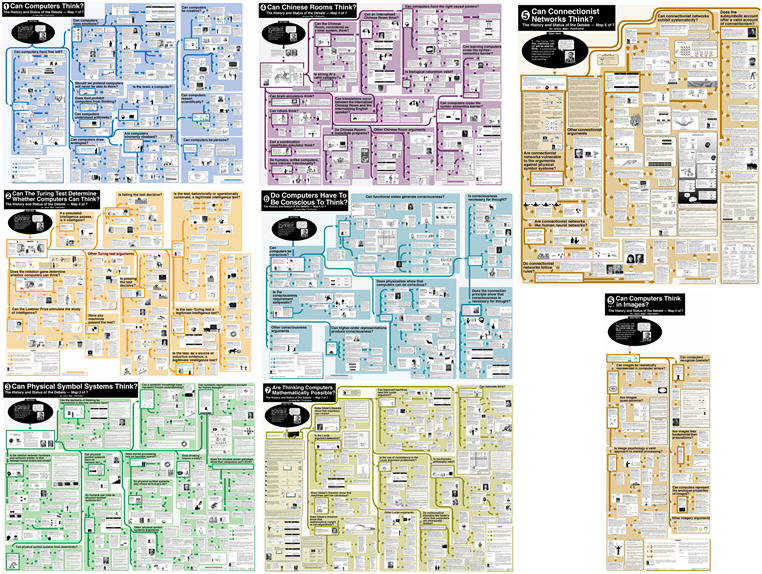
The project culminated, in 1999, with the publication of seven remarkable 3’ x 4’ paper-based maps, encompassing more than 800 arguments advanced by over 300 of the finest minds of our generation, including: Alan Turing, John Searle, John Lucas, Herbert Simon, Douglas Hofstadter, Marvin Minsky, Daniel Dennett, Roger Penrose, Hilary Putnam, Stephen Kosslyn, Zenon Pylyshyn, James McClelland, Hubert Dreyfus, Ned Block, James Moor, Jack Copeland, Selmer Bringsjord, David Rumelhart, David Chalmers, and George Lakoff.

Robert Horn’s Can Computers Think? maps

Robert Horn's Can Computers Think? Maps

(copies of the maps can be ordered here)

The set of maps is a masterpiece and an extraordinary gift to humanity; allowing anyone to gain a deep understanding of the structure and content of fifty years of intricate debate after a few hours of study rather than years of research. And it exemplifies the potential for maps of this kind to open other domains of debate and knowledge to general understanding.

At the time of publication, Robert Jacobson hailed Bob as “the new Mercator, a pioneering navigator of knowledge”—and, for anyone who has spent time with the set of maps, it easy to imagine that history will view its creation as a significant turning point in the advancement of human learning.

However, for all its astonishing brilliance, the set of maps also speaks to the challenges that remain in the field:

  • The maps exist because of the Herculean endeavour of a small team of people over many years.
  • The territory, unlike the maps, continues to evolve.
  • The maps have physical boundaries, beyond which lie uncharted territory.

So what next?

What if you could lift Bob’s map off the page and recreate it online with all the arguments open to collaborative editing and evaluation by many people rather than a few; make the structure of the map fluid so that the debate can evolve as new arguments and evidence emerge; and allow related maps to interconnect so that, in principle, there is no limit to the territory that can be covered?

With Bob’s blessing, I am delighted to announce today that this is what we have done.

The top layer of the debate map is shown below: to open and explore the full map click on the View live button.

The translation will continue over the coming days, with more images and cross-relationships to add; however, the essence of the map is in place now and open to extension by anyone with an interest in the field.

If you would like to participate in this process, or the formal launch event next year, register online or contact me via the e-mail address above.

There’s more to discuss in future posts, including: the translation process, the expansion of the mapping approach to other fields, and the importance of the Can Computers Think? debate itself.

For now though, I’ll leave you with Bob’s map—and the view it affords from many tall shoulders.

Rethinking Drugs Policy

Following the publication of the report by the RSA Commission on Illegal Drugs, Communities and Public Policy earlier this year, the Debatemapper team worked with the RSA to create a debate map of the case made in the report for rethinking UK drugs policy.

The map decomposes the report’s arguments into constituent elements, each of which is open to further refinement, challenge, comment and evaluation. You can see the top level structure of the map in the debate strand below.

The Commission’s report is intended to feed into the UK Government’s 2008 review of the National Drugs Strategy; for which a formal public consultation process is underway. You can read more about the RSA’s other initiatives in this context here.

The debate map is now open to editing, comment and evaluation by anyone with an interest in the drugs policy field, and we hope that over time a community of experts will form around the map to cultivate it as a permanent resource for drugs policy stakeholders in the UK and beyond.

With the wider international debate in mind – and to illustrate how Debatemapper can be used to build clusters of interrelated maps – we have also created a new map from an existing strand of the RSA debate map, which explores the arguments for and against the legalisation of drugs.

The top-level arguments are shown in the strand below. Like a wiki, the debate map is inherently provisional and open to further refinement. So if you spot any gaps or weaknesses in the arguments or if you have any new lines of thought or evidence to contribute, please feel free to sign in and start editing and evaluating the map straightaway. Video and text help is available directly from the map.

Mapping the Prime Minister's Media Debate

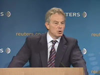
On 12 June 2007, just before he stepped down as UK Prime Minister, Tony Blair delivered a lecture about the state of the relationship between politics and the media.

Tony Blair's lecture at Reuters (Source: Reuters)

The Debatemapper team was invited by the Prime Minister’s Office to model the PM’s argument and the ensuing debate; with the structure and content of the debate map fully editable online by the lecture delegates and an invited group of e-democracy experts.

To the best of our knowledge(*), this is the first time in world politics that a live web-based, collaboratively editable debate map has been used in this way. And is further testimony to the pioneering spirit of the Downing Street digital communications team (notably Jimmy Leach, Neil Franklin and, formerly, Ben Wegg-Prosser).

During the mapping project we analysed the arguments presented in 102 media articles – ranging from Fox News to Media Lens – and included arguments advanced by, among others, Andrew Gilligan, Alastair Campbell, Paul Staines and Michael White.

As the Prime Minister anticipated in his speech, the dominant theme of the immediate commentary might be characterised as “look who’s talking”. Indeed, for a substantial proportion of the articles this was the only line of argument developed.

Strikingly, even the articles that engaged with the substance of the argument did so via relatively shallow and narrow reasoning; an observation on the quantity and diversity of the arguments offered in the individual articles (constrained, no doubt, by time and word count) rather than the quality of the arguments or, indeed, the arguer.

To a casual reader, it would be easy to view this surface impression as indicative of the systematic dysfunction identified in the speech. However, the surface impression is misleading in this case.

Although most of the articles made a small number of points, and a few points appeared in most of the articles, the complete set of arguments expressed across all the articles constituted a mature and reasoned response to the Prime Minister’s lecture and developed the debate significantly beyond the case he outlined.

The challenge in perceiving the underlying richness of the response is that the arguments are distributed thinly across the articles rather than concentrated in a few.

Debate mapping addresses this problem by collecting and organising the arguments into a single coherent structure, articulating each argument fairly and concisely, and filtering out the noise arising from repetition, rhetoric and digression.

In this way, editable online debate maps offer readers a comprehensive and highly distilled perspective on the arguments raised in a complex debate and a means to contribute directly to the structure of that debate; the trade-off is the structural discipline and learning-curve involved in building and exploring the maps, which will not be to everyone’s tastes.

The lecture debate map (which you can access via the “View live in context” button in the short debate strand below) helps us to see both how the collective media response expanded the debate beyond the argument outlined by the Prime Minister and, perhaps more significantly, how the analysis, both in the Prime Minister’s speech and in the media response, was heavily weighted towards the diagnosis of the perceived problem as opposed to its resolution.

While some commentators disputed the degree of the dysfunction in the relationship between politics and the media, and others emphasised a proper role for scepticism in the relationship, almost all acknowledged the existence of a troubling dysfunction.

Such systemic phenomena are difficult to break. So it has been encouraging in the last few weeks to see signs of willingness on both sides to explore potential ways forward.

It would be interesting too, reflecting on the observations above, to examine more thoroughly the extent to which the perception of a dysfunctional relationship between politics and the media is skewed by an eye-catching but misleading surface impression that obscures a richer and more mature relationship below. To the extent that this is the case, the foundation for change may be stronger than it first appears.

The current debate map was conceived as a time-limited experiment linked to the lecture, and ending with the Tony Blair’s departure from office on 27 June. The map is far from exhaustive, capturing only the arguments raised during this period, and, like a wiki, remains inherently provisional and open to further refinement. For anyone minded to use the map in such a way, it may well contain the seeds for a mediated solution to the underlying problem.

In the meantime, a huge thank you to everyone who helped us with the project and gave us detailed feedback; the fruits of which are embodied in the latest release of Debatemapper, of which more later.

*If you know of any other examples, earlier or not, we would love to hear about them.