Category: Barack Obama
Mapping the Political Contours of Cyberspace
William Gibson coined the term “cyberspace”, for his 1982 short story Burning Chrome to create a “a narrative engine, and a territory in which the narrative could take place”. Twenty years on, cyberspace is the world’s narrative engine: and an uncharted territory to which the world is still coming to terms.
Political, industrial, and civic leaders are gathering at the Foreign Office’s London Conference on Cyberspace next week to think through the implications, opportunities and contradictions of this emerging world.
The conference will explore key themes – prosperity; social good; freedom of access and expression; cyber crime and international security – with the aim of deepening mutual understanding and beginning to outline a political, social and economic strategy to secure the benefits of cyberspace while addressing the concomitant threats to personal and national security.
The Foreign Office would like the dialogue at the event and online to be as broad as possible – and, in support of this process, Debategraph will be mapping and curating the dialogue as it unfolds live and online.
To start exploring the map – which we have seeded with the initial framework of the conference – click on the small bubbles to move deeper into the debate and on the larger bubbles to move back up.
You can gain an insight into the range and scope of the debate by watching the map evolve here, but you are welcome to add your voice to the debate online by adding new ideas and comments to the map and by rating the ideas, or by suggesting new ideas and questions via Twitter using the #LondonCyber hashtag and/or the Foreign Secretary’s Facebook channel (both of which we will be monitoring as well).
As discussed before, the whole structure of the map is like a wiki – every aspect is provisional, and open to further refinement – and everyone can add new issues, positions, arguments and evidence to the map.
The aim is to weave together all of the arguments into a rich, transparent, non-linear structure that anyone can explore and understand quickly.
As with the other maps in the The Independent series you can keep up to date with developments via @TheIndyDebate on Twitter, and you are welcome to embed the map (like a YouTube video) on your own site or blog using the code shown below:
*Cross-posted at: The Independent
Collaborative Democracy in the White House
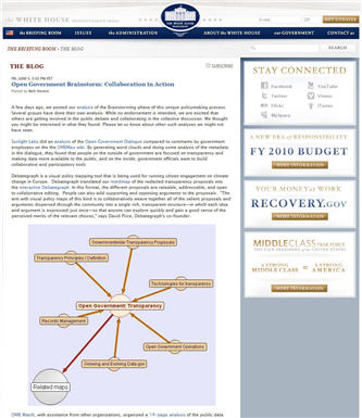
If you have been following the White House’s groundbreaking Open Government Initiative over the past few weeks, you’ll be aware already that Debategraph has been mapping the proposals emerging from the Open Government Brainstorming sessions on Participation, Transparency and Collaboration.

The Open Government Initiative moved into the third, and most significant, Drafting phase today—and we’re delighted to note that the White House’s Open Government team has entrusted this vital phase to our favourite wiki team at MixedInk (who, if you haven’t discovered them yet, offer a truly innovative and powerful approach to the task of collaborative writing, which is ready to be applied in multiple contexts).
The initial Open Government Brainstorming and Discussion phases have been stimulating and generative, but the real collaborative work, the real collaborative responsibility, and the real collaborative opportunity lie in the next phase of synthesis.
So get writing!
…and, to help you on your way, here’s the combined Debategraph of the redacted proposals from the three brainstorming sessions:
Dissecting the G-20 Communiqué
So what are we to make of the G20 Communiqué?
As part of The Independent’s visual mapping of the London Summit, we have broken down the G20 communiqué into an interactive visual graph, that lets you comment on and rate each of the major points.
…and we want to know what you think about the measures proposed.
So, start exploring the interactive graph below—by clicking on the spheres—and log-in to tell us if you’re feeling quantitatively eased or squeezed.
And why?
Obama: Making Sense of the World?
And so the kaleidoscope turns, and we see the world anew.
Or do we?
Barack Obama’s inauguration today as the 44th President of the United States of America, marks the end of a remarkable personal and national journey. Arrival at such a destination is a cause for global celebration. But as with all great journeys the arrival is also only a beginning.

Obama is taking a leading role in a world system that is severely perturbed on multiple levels. Such perturbation often proceeds collapse: and can proceed the emergence of a more sophisticated and better-adapted system.
It’s not clear—it never is—to what extent the choice of branching paths is open to us. But it surely behoves us to act as if it is.
My (personal) sense is that we face a mess of complex, interrelated and non-linear problems; sane responses to which lie beyond our existing methods and tools. In essence, we need to re-configure our modes of political thinking and organization to enable us—as local, national, and international communities—to move significantly closer to collective maxima of intelligence (both reasoned and emotional).
For those for whom the analogy is familiar, we’re awaiting The Mother of All Demos in the political realm to match Doug Engelbart’s technological masterpiece 40 years ago (which pre-figured much of the technological landscape that we inhabit and take for granted today). It’s the social dimension of Engelbart’s vision of augmented collective intelligence that lags behind our technological achievements: and it needs to catch up quickly.
The signs are that Obama, and the team around him, are mindful of this. As others have noted already, one of the most encouraging aspect of the Change.gov experiment was the speed at which the interaction on the site improved iteratively across the transition. The challenge now is how to crystallize this process—to enable genuine and deeply collaborative sensemaking—and how to set this process in motion in the first few months of the administration when the opportunity and receptivity to change are greatest—and when the character of the administration will be forged.
Readers of The Independent and others who have joined in developing the Obama and Gaza maps over the last couple of months have demonstrated on a smaller scale and in vitro that different and radically collaborative models of sensemaking are possible—and we are grateful to everyone who has participated directly so far, blogged about and embedded the maps, and to the BBC World Service’s Digital Planet, BBC Technology and PRI’s The World: Technology podcast for their support in spreading the maps more widely.
Both maps will continue to develop as exploratory exemplars of the kinds of cumulative, comprehensive and distillative sensemaking processes that the web is starting to enable—with the Obama map, in particular, shifting to a focus on the first 100 days.
Deeper challenges remain. The emerging set of collaborative sensemaking and deliberation tools of which Debategraph, is one example, are still nascent, still figuring out the basic principles—still more VisiCalc than Excel. The tools require a basic visual literacy that itself is only just beginning to emerge in society. And the maps, and other sensemaking constructs, require time to build and time for reflection in an impatient and attention-poor age.
But, today, of all days, is a day for optimism. The day on which Barack Obama embodies the realization that long journeys towards distant mountain tops can reach the summit.
Cross-Posted at: Independent Minds
Mapping the Crisis in Gaza
As the What Should Obama Do Next? map began to address the unfolding events in Gaza last week, it was soon apparent that the immediate crisis and the wider Arab-Israeli conflict merited detailed consideration on a new map.
To this end, Independent readers and the Debategraph community have begun to seed a map on the crisis; including arguments raised by Robert Fisk and Johann Hari, and some of the questions and answers from the Twitter press conference organised last week by the Consulate General of Israel in New York.
The Gaza map (above)—which will require significant iteration and community input from a wide range of voices to reach maturity—is motivated by two medium-term objectives:
(1) to present the different worldviews that underpin the conflict fairly and succinctly on a common map.
(2) to map creatively and constructively the options open to the participants in the conflict and the international community, and the arguments for and against the different options.
This is an emotive subject, and the map is at an early stage of development; so if you see statements with which you disagree strongly or spot gaps in the arguments, please help us to address these on the map.
After logging-in, anyone can add new issues, positions and arguments, edit and restructure the map, and evaluate the different arguments; so the whole structure evolves as new perspectives are added to the map.
Hence, every aspect of the map at this stage should be regarded as mutable and provisional—with the aim being to enrich the structure iteratively and collaboratively until the map reflects a maximum of community intelligence.
As with the Obama map, you can also keep up to date with developments on the Gaza map via @TheIndyDebate on Twitter.
Cross posted at: Independent Minds
Towards Live Government…
The Independent’s mapping project, What Should Obama do Next? , is one of multiple initiatives appearing across the web linked to the Presidential inauguration of Barack Obama.
As Jimmy observed in his blog on the Huffington Post, mastery of internet campaigning is not the same as delivering government via the web. So it has been fascinating the observe the first edemocratic steps on Obama’s Change.gov site.
The Change.gov process so far has included blogging, YouTube insights and feedback (example below), threaded commenting, and the admirable step of opening up the content on the site via a Creative Commons license—and the volume and variety of the feedback on the discussions around health care (3,701 comments) and the economy (3,563 and counting) illustrate the potential and the challenges involved in processes of this kind.
Dan McSwain is right to note that "no other transition team has ever opened these types of channels of communication with the American people" and the team’s early energy, enthusiasm and willingness to experiment are praiseworthy; though, no doubt, like all start-up developers in public beta they’ll be attuned to thoughtful and constructive criticism as part of their process of continuous development.
Sustaining this openness to iterative experimentation will be one of the keys to fulfilling the transition team’s early promise beyond the inauguration. In part, this is because the capabilities of the web are evolving rapidly. YouTube and Twitter, for example, two of the most significant on-line tools used during the campaign, didn’t exist at the time of the last Presidential inauguration (and Twitter was only formally incorporated after Obama declared that he was running for office).
But, more fundamentally, it is because this openness to iterative and collaborative experimentation and improvement is one of the web’s deep lessons and, potentially, contains the means to transform our understanding and experience of governance.
Doc Searls refers to this wider emerging process as the "Live Web", and so, in his honour, we might characterise the opportunity ahead for the Obama transition team as being the chance to the effect significant shift towards "Live Government".
For the first time in modern industrial society, governments have the chance to realise the potential embodied in Bill Joy’s observation that there will always be more smart people outside government than within it…
And, in view of the scale and complexity of the challenges faced in the early 21st century, there has never been a more urgent time to realise this latent, distributed potential.
Live Government will take many forms that we can’t see clearly yet; however, two dimensions that seem central to the concept based on current trends are:
(1) Making the data of governance fluid, transparent, mashable and easily discoverable in context; getting the data in front of the people who have a contribution to make, and ensuring that the data is continuously up to date. This trend can be seen in the US in the form the Sunlight Foundation and the recent Apps for Democracy competition—both of which owe something to the pioneering work of the MySociety team in the UK.
(2) Externalising the current policy thinking of government in a open structured form to which people can contribute continuously, directly, precisely, cumulatively, and with a high signal-to-noise ratio. This trend, still comparatively nascent, can be seen in a prototypical form in policy wikis, annotation tools and sensemaking tools (of which Debategraph is an example).
It’s against this background that the latest development from the Obama transition team—in making all policy documents from official meetings with outside organizations publicly available for review and discussion on Change.gov—offers a tantalisingly encouraging sign.
As Dan McSwain, again, notes:
"…we’re inviting the American public to take a seat at the table and engage in a dialogue about these important issues and ideas—at the same time members of our team review these documents themselves."
It will be fascinating to see if the Obama transition team can carry this energised enthusiasm into office.

MAP UPDATE:
Thank you to everyone who has contributed to the development of the map over the last week, and to the people below for helping the map meme to circulate in the blogosphere:
Visual Mapping, Benchmarking e-gov, Tomorrow Happens, Heuristiquement, and @stoweboyd, @grisvert, @TheMindMapWatch, @jeanlucr
..and incidentally, henceforward, as well as the map email digests and RSS feed you’ll also be able to keep track of the latest developments on the map here http://twitter.com/TheIndyDebate.
Cross Posted from: Independent Minds.
Help us map the mind of the blogosphere
Cross-posted from: Independent Minds
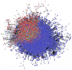
To celebrate the launch of The Independent Minds blogs, and as part of our Obama project with The Independent newspaper, we are launching a global experiment to map the mind of the blogosphere.

Source: Matthew Hurst’s Blogosphere Meta-Core.
Not all of it, obviously… not, for example, the part that’s thinking about Britney Spears and Angelina Jolie.
We’re just focusing on the part thinking about the inauguration of the new President and the choices he faces. And we want to transfer the collective insight of the blogsophere into the map that’s already building here.
Can we do it? With your help… yes we can.

We’re not expecting you to learn the pros and cons of argument visualization; though if you want to stretch your mind with something other than a Crossword or Linkudo we’d love to help.
Instead, all you have to do, if you are blogger, is to let us know when you have posted about Obama and any of the policy issues he faces. You can do this in two ways:
(1) Include a link to the map in your blog post:
http://www.independent.co.uk/news/world/americas/article1022466.ece
or,
(2) Embed the map like a YouTube video, using the code below:
<iframe src=’http://debategraph.org/flash/fv.aspx?r=7714&d=2&i=1′ frameborder=’0′ width=’490′ height=’650′ scrolling=’no’></iframe>
Then tag the post TheIndyDebate. When you do this, we’ll detect the post and start to include your thoughts in the map.
Embedding the map will let your readers watch the map evolve in situ on your blog. And, if you link to or embed the map, we’ll publish a reciprocal link (both here and on the Independent Minds blog) back to your blog.
Starting now with: Ideal Government, Contrary Brin, AlwaystheTwain.
If we miss a blog post, email me at david AT debategraph DOT org – and if you’re not a blogger, but know someone who might interested in participating, please pass the links along.
What should Obama do Next? The Independent series launches…
In the build up to Obama’s inauguration on 20th January 2009, The Independent and Debategraph have teamed up to give the world a chance to map and explore what Obama should do next. Click here for the map.

Over the next 10 weeks, Independent readers and the Debategraph team will develop a series of interrelated debate maps of the key policy and political questions facing Obama as he prepares for office.


Whether it’s tackling the global financial crisis, deciding who to appoint to key cabinet posts, or determining how to proceed on climate change, Iraq or the crisis in the Congo, you are welcome to join us in building comprehensive maps of the political choices open to Obama, the arguments for and against the different options, and the path you think Obama should follow.
Each week, we’ll be seeding the maps with an article from The Independent or The Independent on Sunday and beginning to layer in the positions and arguments from the Obama team’s published agenda and public statements.
You can watch the maps evolve in the build up to the inauguration, or better still register and begin to comment, suggest new issues, rate the options and arguments, and add new options and arguments of your own.
I’ll describe the process in more detail over the coming weeks, but for now we have seeded the opening map on The Independent’s website with the arguments from Philip Bobbitt’s article The flag-waving is over. This is how the president can change the world (examining some of the international policy options open to Obama), and Leonard Doyle’s Obama Starts to Build a ‘Team of Rivals’ (considering whether Obama should appoint Hillary Clinton as his Secretary of State).
Visualizing the American Choice
As Americans congregate at the polls and the world looks on in wonder, I thought that would be interesting to visualize the choice as seen through the eyes of the endorsement editorials of the Washington Post (which came out in favour of Obama) and the Washington Times (which came out in favour of John McCain)…
…with the arguments presented in the Election FAQ overview created by Google’s Director of Research, Peter Norvig, layered in below for extra texture:
![Reblog this post [with Zemanta]](https://img.zemanta.com/reblog_e.png?x-id=c96fd920-9824-4bd0-9a88-895db173720b)